rise &
reign long.
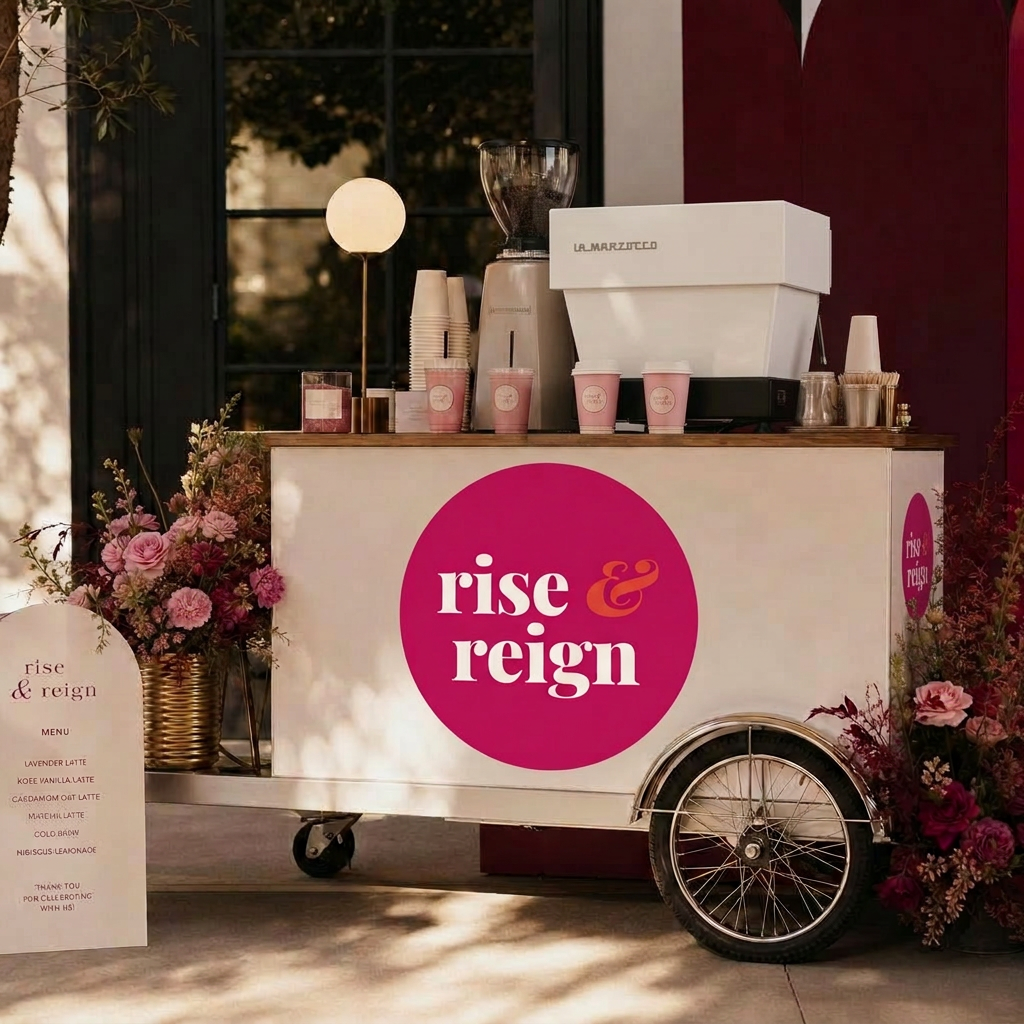
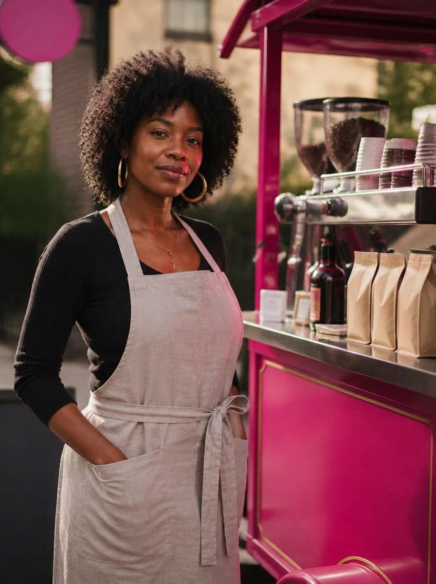
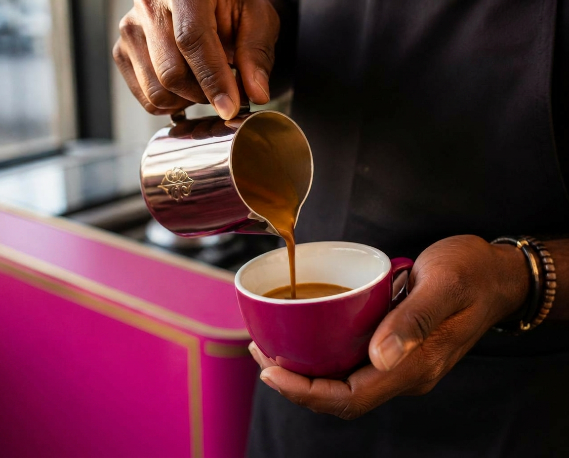
A mobile wellness coffee bar built for the long day. This guide holds the marks, colors, type, and voice that keep every touchpoint feeling grounded, quietly bold, and unmistakably ours.
Magenta & coral, always.
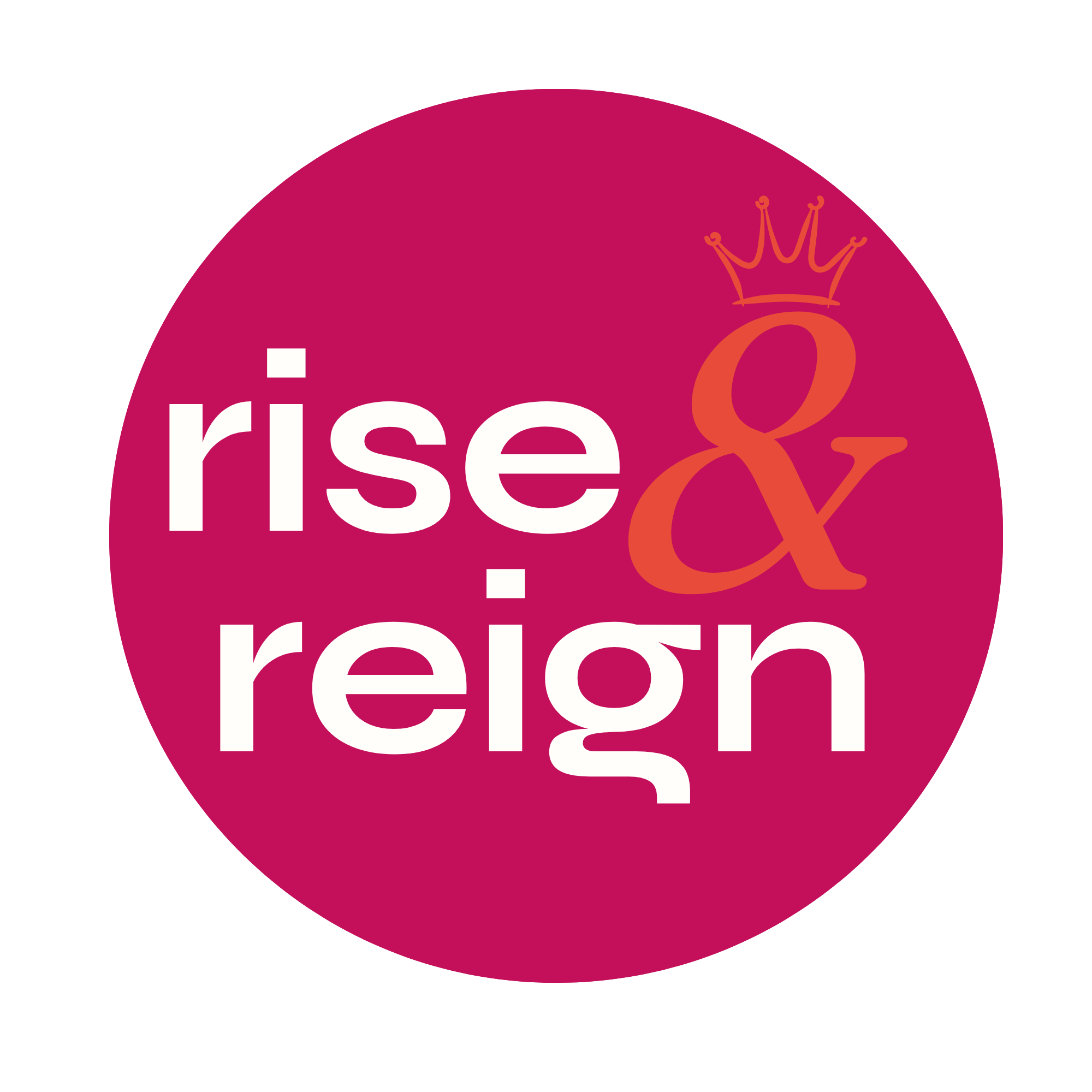

Eight colors. One mood.
Syne. Jakarta. Fraunces.
taste and see that the Lord is good.
Psalm 34:8 · used for scripture bands & the wordmark ampersand only
Four pillars, one voice.
Intentional
Every word earns its place. No filler, no hype language, no exclamation marks. If it can be said with fewer words, say it with fewer.
Quietly bold
Confidence without volume. State the thing plainly and let it land. We don't shout — we set the room.
Warm & grounding
Hospitality first. Copy should feel like a hand on a shoulder — steady, kind, unhurried, present.
Feminine & fierce
Soft edges, sharp intent. Pretty on the surface, principled underneath. Never precious.
Pills, tags, and edges.
Blush wash · signature
Blush-burgundy · featured
Do this. Never that.
Always
- Use white as the primary page background.
- Pair magenta "rise" and "reign" with a coral italic ampersand.
- Reserve pill radius (9999px) for CTAs only — cards stay sharp.
- Set body copy in Plus Jakarta Sans, headlines in Syne.
- Use yellow-green as an electric accent on light backgrounds.
- Keep copy under two lines when possible. Say less.
Never
- Set yellow-green type on burgundy or ink backgrounds.
- Use coral as a full-section background — accent only.
- Round card corners or add drop shadows to containers.
- Introduce purple, violet, or teal — off-palette.
- Use emojis, exclamation points, or hype language.
- Substitute Inter, Poppins, Playfair, or Montserrat for our type.
taste & see
that the Lord is good.
Marks & imagery.


Syne — fonts.google.com/specimen/Syne · weights 500, 600, 700, 800
Plus Jakarta Sans — fonts.google.com/specimen/Plus+Jakarta+Sans · weights 300, 400, 500, 600, 700
Fraunces — fonts.google.com/specimen/Fraunces · italic only, for the ampersand & scripture bands